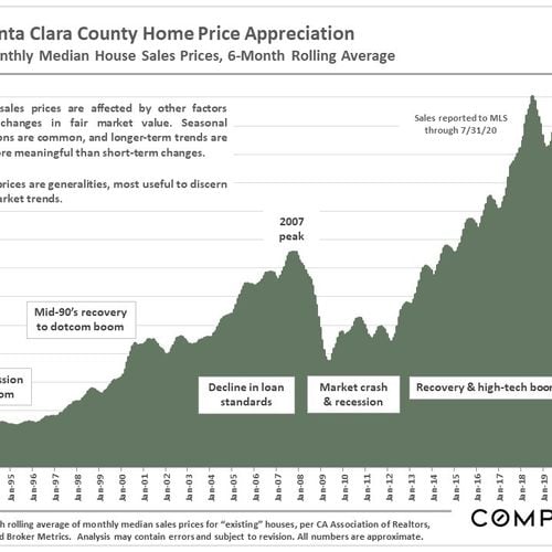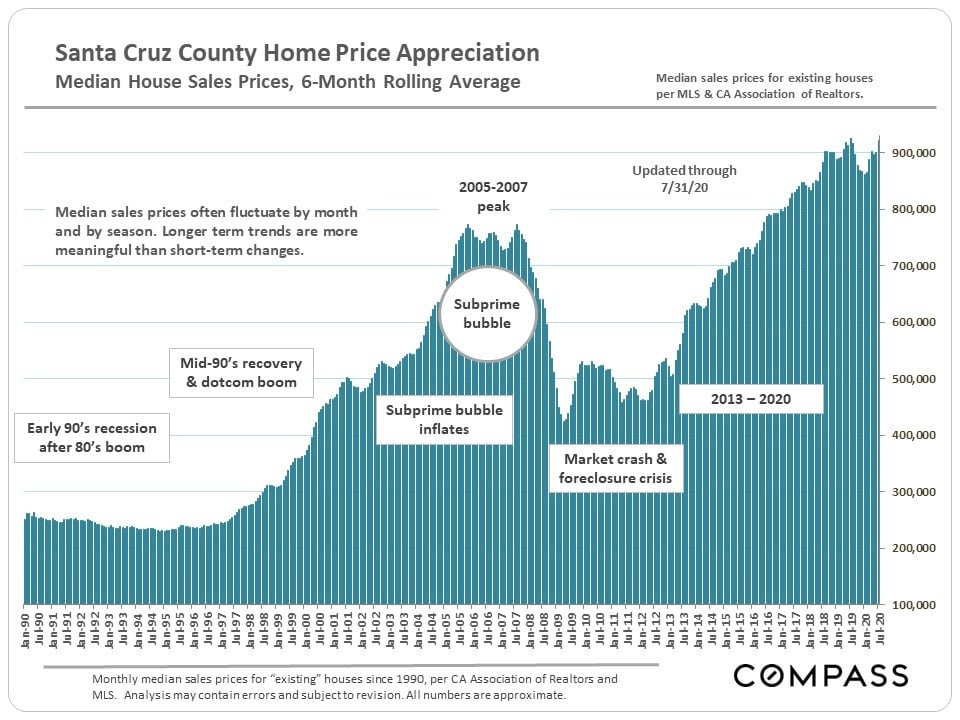
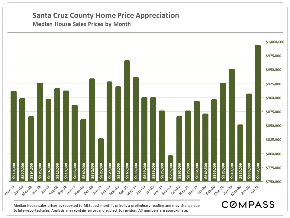
Median House Sales Price – Short-Term & Long-Term Trends
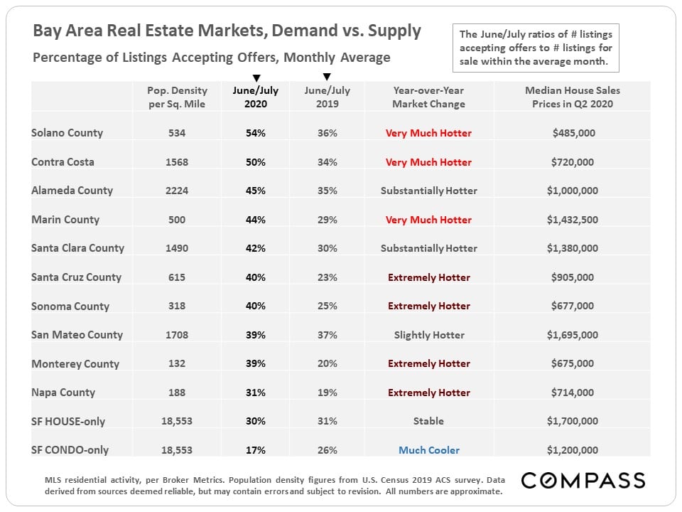
Bay Area Markets Comparison
This table ranks each county by the percentage of active listings going into contract in June/July 2020, a standard statistic of market heat, compares it to the same period of last year, and then rates the scale of the year-over-year change. Many counties are seeing dramatically increased demand over last year, with Santa Cruz seeing one of the biggest jumps.
Supply & Demand
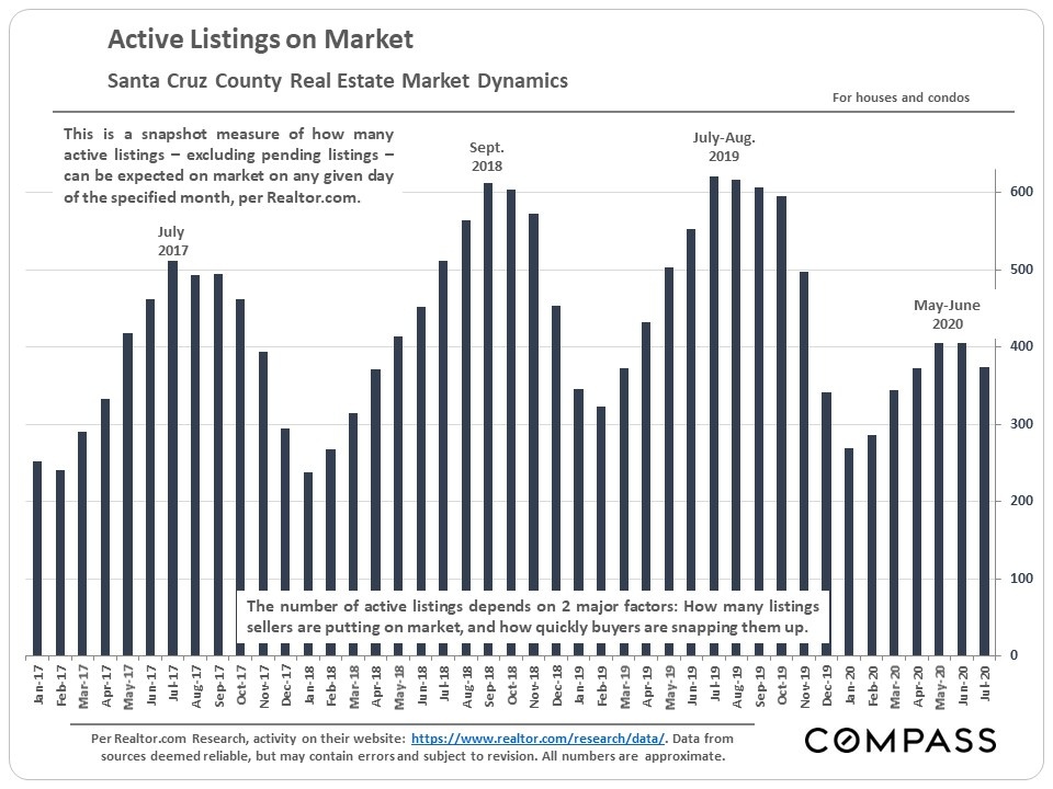
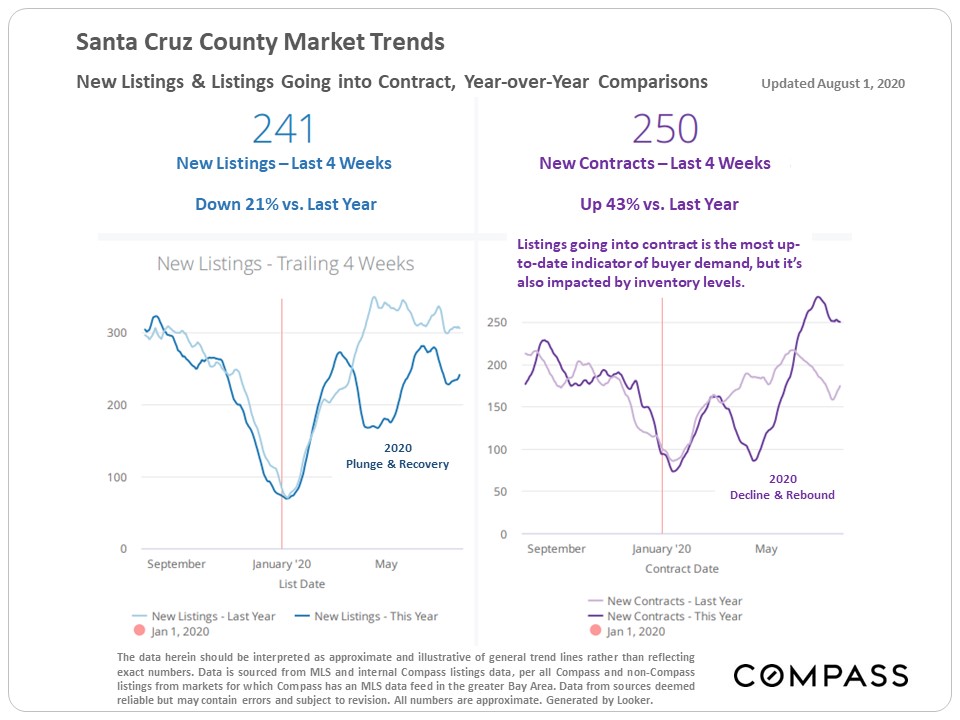
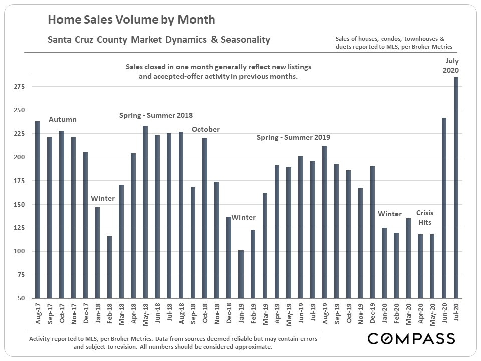
Active listings, new listings, listings going into contract, closed sales volume Lower inventory levels + increased buyer demand
Higher-Price Home Sales – Year-over-Year Comparisons

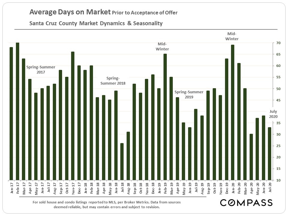
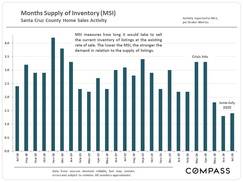
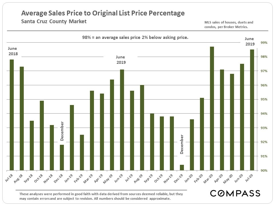
Selected Market Indicators
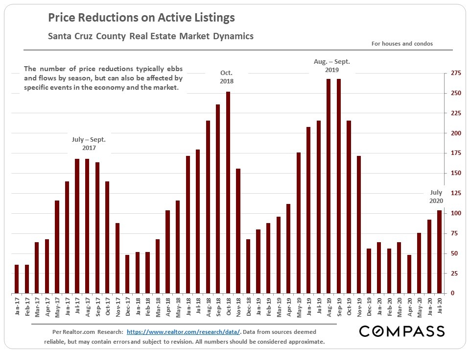
Price reductions, average days on market, months supply of inventory, sales price to list price percentage
Time to talk to a REALTOR?